Last updated: 4 September 2026
1Introduction
Quick Answer: Good photo booth branding means a legible mark, a readable line of information and generous space around faces, designed separately for the printed strip and the digital file.
Most branding briefs for a photo booth arrive as a logo file and a sentence: put this on the print.
What comes back is technically correct and quietly wasted. The logo sits in a corner at eight millimetres, the event name runs across somebody’s forehead, and the whole thing is invisible the moment the photograph is reshared on a phone.
The frustrating part is that the artefact is genuinely valuable. A print outlives the event by years, and the digital copy travels further than any advertisement the company paid for that quarter.
It is worth doing properly at scale, too. With internet use among individuals at 98.3 per cent in the Department of Statistics Malaysia’s 2025 survey, almost every guest who receives a file is capable of resharing it within the hour.
Watch: how a print template is actually built
A walkthrough of building a custom print layout, showing where the photo windows sit and how much usable margin an overlay really has. Useful before you brief a designer.
Source: Own Your Moment Co
2What the print has to survive
Quick Answer: A booth print is handled immediately, carried in a bag, photographed at an angle in poor light, and then reshared as a small compressed image. Every design decision should assume that sequence.
Studio artwork is judged flat on a screen. A booth print is judged in a ballroom, at arm’s length, under warm light, by somebody holding a drink.
Then it goes through a second life that most designers never plan for. Guests photograph the print with their phone at an angle, crop it roughly and post it. Fine detail is gone by the second step.
That journey rules out several habits imported from print advertising. Thin typefaces disappear. Pale grey text on white vanishes under warm venue light. A logo reversed out of a photograph competes with the faces behind it and loses.
What survives is boring and effective: a solid mark at a sensible size, one line of text with real contrast, and clean space around it.
There is also a physical constraint worth naming. Dye sublimation prints emerge warm and are handled straight away, so an overlay running to the very edge of the strip will be partly covered by fingers within seconds of it being taken.
3The layout decides how much room you have
Quick Answer: A four-pose strip leaves a narrow footer, a single large print leaves a proper branding band, and a landscape print gives room for a logo lock-up beside the image.
Before anyone designs anything, choose the layout, because it sets the budget for branding in millimetres.
| Layout | Branding room | What fits |
|---|---|---|
| Four-pose strip | Narrow footer only | Mark plus one short line |
| Three-pose strip | Deeper footer | Mark, event name, date |
| Two-pose portrait | Generous band | Full lock-up and a call to action |
| Single large print | Full width band | Everything, comfortably |
| Landscape single | Side panel possible | Logo beside the image |
Illustrative planning model rather than fixed ShutterPop print specifications. Exact dimensions depend on the printer and media in use.
The pattern is simple. More poses means less room, and a strip that carries four images plus a logo, an event name, a date, a hashtag and a website carries none of them legibly.
4The logo is rarely the most valuable element
Quick Answer: A logo alone tells a stranger nothing. The date and a short line naming the event or a way to reach you do more work, because the print is still in circulation long after the event is forgotten.
This is the argument most template galleries never make, and it is the one that changes results.
Consider who sees the print in a year. A colleague, a family member, someone scrolling past a reshared photograph. They recognise the people. They do not recognise a small mark in a corner, and they have no reason to look it up.
Now add the date and four words naming the occasion. The same image becomes a record of something, which is the reason people keep it, and the mark next to those words gains meaning by association.
For a brand activation the calculation shifts again. There, the print is a media placement, so the line that earns its space is the one that lets a stranger act: a short domain, or a handle worth following. Tracking whether that line does anything is the subject of our guide to measuring real activation ROI.
The practical rule is a hierarchy of three. One mark, one line of meaning, one optional call to action, and nothing else on the strip.
5Colour, contrast and brand palettes
Quick Answer: Brand colours shift on booth prints because the light in the room is warm and the media is not a screen. Pick the two strongest colours in the palette and let the rest go.
A brand palette designed for screens meets three complications inside a booth print.
The first is the light. Ballroom lighting is warm, and although the flash dominates the exposure, ambient colour still creeps into the edges of the frame and sits beside your printed panel.
The second is the media. Dye sublimation is a good process, but a pastel corporate secondary colour arrives softer than the brand book promises, and two adjacent pastels stop being distinguishable.
The third is competition. Every colour in your frame competes with skin tones and clothing for attention, and a saturated band beside a face will win, which is not usually what anyone wanted.
White is the current trap. Pantone named PANTONE 11-4201 Cloud Dancer its Colour of the Year for 2026, and requests for white frames followed. On a print, white borders merge with pale outfits and white backdrops, so if you want the reference, put it in the props or the backdrop and keep a defined edge on the print itself.
6The digital file is a different design
Quick Answer: Social platforms crop to square and vertical shapes, so the printed strip layout survives badly. Ask for a separate vertical version with the branding repositioned.
Here is where most events lose the reach they paid for.
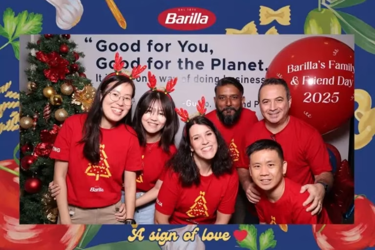
The strip is designed tall and narrow for paper. Uploaded to a feed it is either letterboxed into a small ribbon or cropped, and the crop removes the footer, which is exactly where the branding lives.
The fix costs nothing at the design stage and is almost impossible to retrofit afterwards. Commission two layouts from the same artwork: the print version, and a vertical or square digital version with the mark moved into the image area where a crop cannot reach it.
While you are at it, ask what the delivery looks like. A guest who receives a file through a QR code and a landing page is one tap from sharing it, and that page is itself a branded surface most companies forget to design.
Name the files sensibly too. A folder of images called IMG_0148 is harder for a communications team to use than one named for the event and the date.
7Branding beyond the print
Quick Answer: The screen, the backdrop, the signage, the sharing page and the booth surround are all brandable, and several of them are seen by more people than the print.
Guests queue in front of the booth for longer than they stand in it. Everything they look at while waiting is available to you.
- The on-screen interface. Start screen, countdown and confirmation, all seen by every single user.
- The signage. A short branded sign at eye level does more than a logo on the machine.
- The backdrop. Effective when it is a texture or a pattern rather than a wall of repeated logos.
- The sharing page. Seen after the event, on a phone, with the guest’s full attention.
- The surround. Panels or a vinyl wrap on the booth itself, which is what appears in other people’s photographs.
The repeated-logo backdrop deserves a note. It works for a press wall, where the point is attribution in published photographs. It works badly at a staff event, where guests can tell the difference between a nice photograph and being used as a poster site.
Getting the balance right is part of the wider question of what the booth is for at a company event, covered in our guide to corporate booth ideas.
8Files, proofs and the approval timeline
Quick Answer: Send vector logo files and the exact event wording at least two weeks out, approve a proof at least three days out, and name one person who signs off.
Artwork problems are almost never design problems. They are file and approval problems.
| Send | Why | If it is missing |
|---|---|---|
| Vector logo files | Scales cleanly | Soft, pixelated mark |
| A mono or reversed version | For dark panels | A white box on the print |
| Exact event wording | Cannot be guessed | A typo printed 300 times |
| Brand colour values | Matching, not guessing | A colour close but wrong |
| Font files or a substitute | Licensing and look | A default typeface |
| One named approver | Ends the loop | Revisions on event day |
Checklist used in this guide. Timelines vary by supplier; the sequence does not.
The last row is the one that saves events. Committee approval produces contradictory comments at midnight before the dinner, and nobody wins that argument.
9Mistakes that repeat
Quick Answer: Overcrowding, tiny type, branding across faces, sponsor logos at equal size, and forgetting the year are the five that appear on almost every unsuccessful print.
The same handful of errors turn up whatever the industry or budget.
- Too many elements. A logo, a tagline, a hashtag, a website and a sponsor row leave no room for a photograph.
- Type below legible size. If it cannot be read at arm’s length, it is not on the print in any useful sense.
- Branding over the image. A watermark across the middle guarantees the print is never displayed.
- Every sponsor the same size. Equal weighting reads as clutter and satisfies nobody.
- No date. The cheapest element on the strip and the one that makes it worth keeping.
There is a sixth, subtler one. Artwork designed on a screen at full size looks balanced, then prints at strip width where the margins were never checked. Always review a proof at actual size, on paper, before signing it off.
10Small print, permissions and reuse
Quick Answer: If you intend to publish the photographs, say so at the booth in plain language, and keep any notice separate from the artwork rather than shrunk into it.
Branded booth photographs are frequently reused in recruitment posts, annual reports and social media, which is a reasonable thing to want and a poor thing to assume.
Say it at the point of use. A short sign beside the booth explaining that photographs may be used by the company, and who to speak to if a guest would rather not appear, is clearer and more respectful than six-point type on the strip.
The regulatory backdrop has firmed up. Malaysia’s amended data protection framework came into force in stages through 2025, and the Personal Data Protection Department has since issued circulars on breach notification and the appointment of data protection officers. Anything the booth collects alongside the image belongs in that conversation.
For sponsor-funded activations, agree reuse rights in writing before the event. Who owns the images, for how long, and in which markets are cheap questions in advance and expensive ones afterwards.
Have a logo and a date but no layout?
Send us your files and the event wording and we will come back with a print proof and a matching digital version — see our branded booth options →
11Conclusion
Quick Answer: One mark, one line of meaning, two colours, generous space around faces, and a separate digital layout. That covers almost all of good booth branding.
Photo booth branding rewards restraint more than invention. The prints that work carry very little, and what they carry is legible from a metre away.
The elements that make a print worth keeping are not the ones marketing usually pushes for. A date and a few words naming the occasion do more for recall than a larger logo ever will.
And the digital layout is not optional. Most of the reach happens on a phone, and a strip cropped for a feed takes the branding with it.
Once the artwork is settled, the next question is whether any of it moved a number, which is what our guide to activation ROI is for. The same discipline applies to wedding print design, minus the logo.
12Frequently asked questions
Can a photo booth print be fully customised with our branding?
Yes. The print overlay, the on-screen interface, the sharing page and often the booth surround can all carry your artwork. The limit is legibility rather than capability, so fewer elements at a larger size gives a better result.
What files should I send for photo booth branding?
Vector logo files, a mono or reversed version for dark panels, exact event wording, your brand colour values and font files if licensing allows. Name one person to approve the proof.
How far in advance should photo booth artwork be approved?
Send files around two weeks before the event and approve the proof at least three days out. That leaves room for one revision without anyone working the night before.
Should the logo go on the photo or in the border?
In the border, almost always. A mark placed over the image competes with faces and makes the print less likely to be displayed or shared.
Do we need a different design for the digital photos?
Yes, if you want the branding to survive. Social platforms crop tall strips, and the crop usually removes the footer, so ask for a vertical or square version with the mark repositioned inside the image area.
Want artwork that still reads after it is reshared?
Send us your logo files, the event name and the date. We will return a print proof and a matching digital layout before you commit to anything.